Blue Relay
Document process management made easy with tasks, workflows and automations.
Role
Product Designer
Timeline
May - Dec 2018
Tools
Figma, Principle, Whiteboard
Overview
I worked on a full redesign of the BlueRelay product from an older design that was done almost 8 years before I got there. It started as a simple visual uplift for certain elements on the screen, but soon identified as needing a much deeper UX and in turn a UI refresh. As a young designer working on his first product, I got a lot of great experience working along-side a team of developers, project manager, and a product owner actively learning new things, tools, and tricks of the trade.
The problem we’re solving
In companies that have heavy use of documents, in industries like healthcare and legal managing documents is a real hassle with multiple people making changes and reviewing files. This makes it hard to cope with high number of changes, creating issues like the document being out of sync or the changes/updates not propagating properly to the latest version of the file or for worse errors being replicated to the different versions of the file.
The main goal was to provide an overhaul to the perception of the product to enter new markets by making it more task focused, while preserving old customers. We did this by making the products two core features Files and Workflows run the show using tasks the anchor, which added the missing project management piece to product.
Constraints
One of the biggest constraints for this project was to make sure not to take any functionality away during the re-design while trying to redefine the product and its features. It became tricky to work with, once we discovered that certain functionality that might not have been the best solution but the users were accustomed to it as they had been using it for a long time.
Research
Prior to starting the redesign process, I carried out a heuristic evaluation of the product to determine usability and identify any major issues in the product. Some of the aggregated feedback included
Hard to navigate to different parts of the system
Users had to use dashboard widgets in order to perform certain actions
System feedback either non-existent for some functions or too intrusive
Workflows provided little functionality besides containing tasks
Split screen for file view contained a lot of information, most of which were forms to be filled out be the users in small areas of the screen
Tasks provided rigid functionality with hard to identify options
Icons not representing the action they performed at a lot of places
No help/FAQ section for the user
Impact : I collaborated with the product owner, dev lead and my manager to prioritize the aggregated outcomes of the evaluation and select the low hanging fruit first in order to provide immediate value to existing customers. This allowed us to focus our efforts on the pain points directly while building on the new direction without losing parts of the application.
Definition and ideation
I collaborated with the product owner, development lead and my manager to decide on the final feature set which included old functionality bits and new parts that would enhance the usage of the product. Through this we defined initial requirements for the product, and start brainstorming ideas.
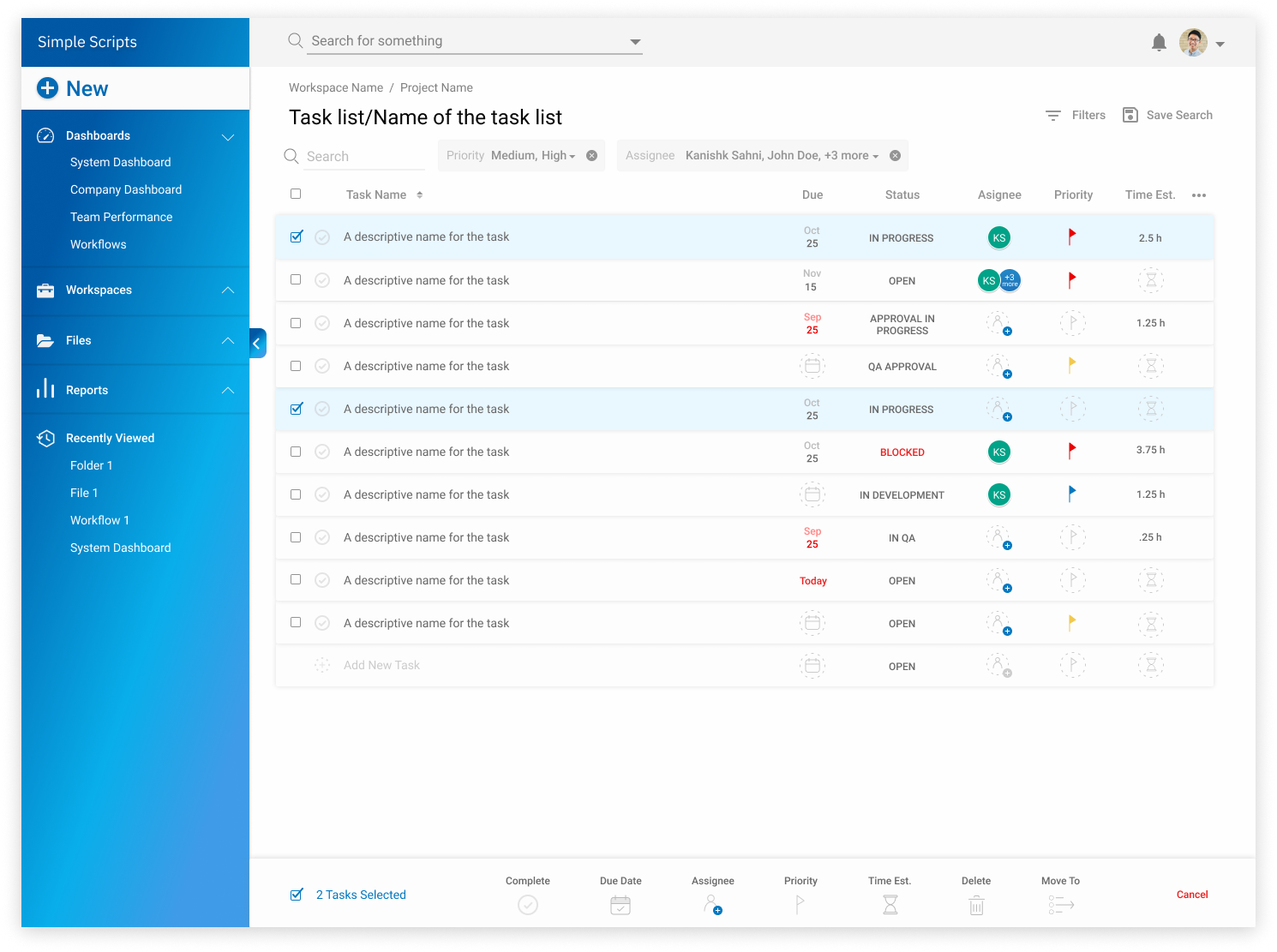
(Current) Final Design
We updated the UI in order to give it a modernistic look and feel. It incorporated a bold look and provided an intuitive flow to the application. Some parts of the design are show below.
Challenges and compromises
In every project there are trade-offs I had a to make some trade-offs working on this project as well a few of them are below
The biggest challenge in this project was being the only person designing while working with 6 developers. Managing time, to create solutions fast enough to keep up with the developers to avoid any bottlenecks as a lot of the dev work was refactoring and not creating it from scratch.
To provide flexibility to the user, we had to let go of the conventional project/folder structure used for management. This would allow the user to get the most value out of the product in a model of their choosing, however simple or complex they required.
We had to tradeoff micro-interactions and visuals, in order to free up design time to work on more advanced features.
Takeaways/learnings
Working on the BlueRelay I got to learn a lot of new things including new tools like Figma, working with developers and the intricacies of working on a product. Here’s some learnings and takeaways:
Low-fidelity mockups hold high importance in the initial stages of the project. It might seem like extra work, but it makes it easier to pivot design direction until ideas converge and a firm strategy is formulated.
Learned how to obtain good feedback. To get good feedback as a designer, I need to ask better more specific questions to get clear constructive feedback.
Learning a new tool is great, but as a designer you should know how to use its features to speed up your workflow. In the case of BlueRelay, I spent countless number of hours fixing issues with parts of the screens while making changes. Towards the end of it I realized the power of components in Figma, which helped me evolve as a designer. I used this extensively in Shuttleops, which later helped me increase my speed while designing and later evolving it into a full design system.


